Creating a brand that can be maintained by non-designers
I recently got in touch with Matt Smith and asked for some help with building up this LinkedIn page (I am inept when it comes to social media and he is very good at it). In turn, he asked for help with branding for a company he's building with Heidi Kirby called Useful Stuff. It's a hub for advice, resources and articles about L&D. Having worked with Matt for a long time, and knowing how switched on he is, I have no doubt this will be massive for anyone working in L&D. His way of thinking is unique and he doesn't bother with fluff.
Here's the challenge though: given this is a startup and not in any way monetised at this point, they needed a brand that could be maintained in-house by Matt and Heidi themselves.
Now, Matt is no slouch when it comes to design. He has a good eye and can get a lot of the way towards a nice design, but he doesn't have the time or resources to be creating a bunch of stuff from scratch.
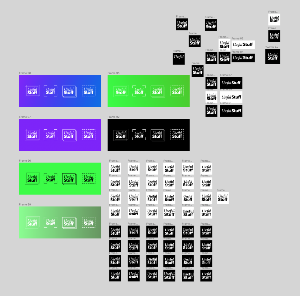
A decent amount of work had already been done by Matt, there was a solid idea for the logo in place and a bunch of iterations of that idea. (pictured below)
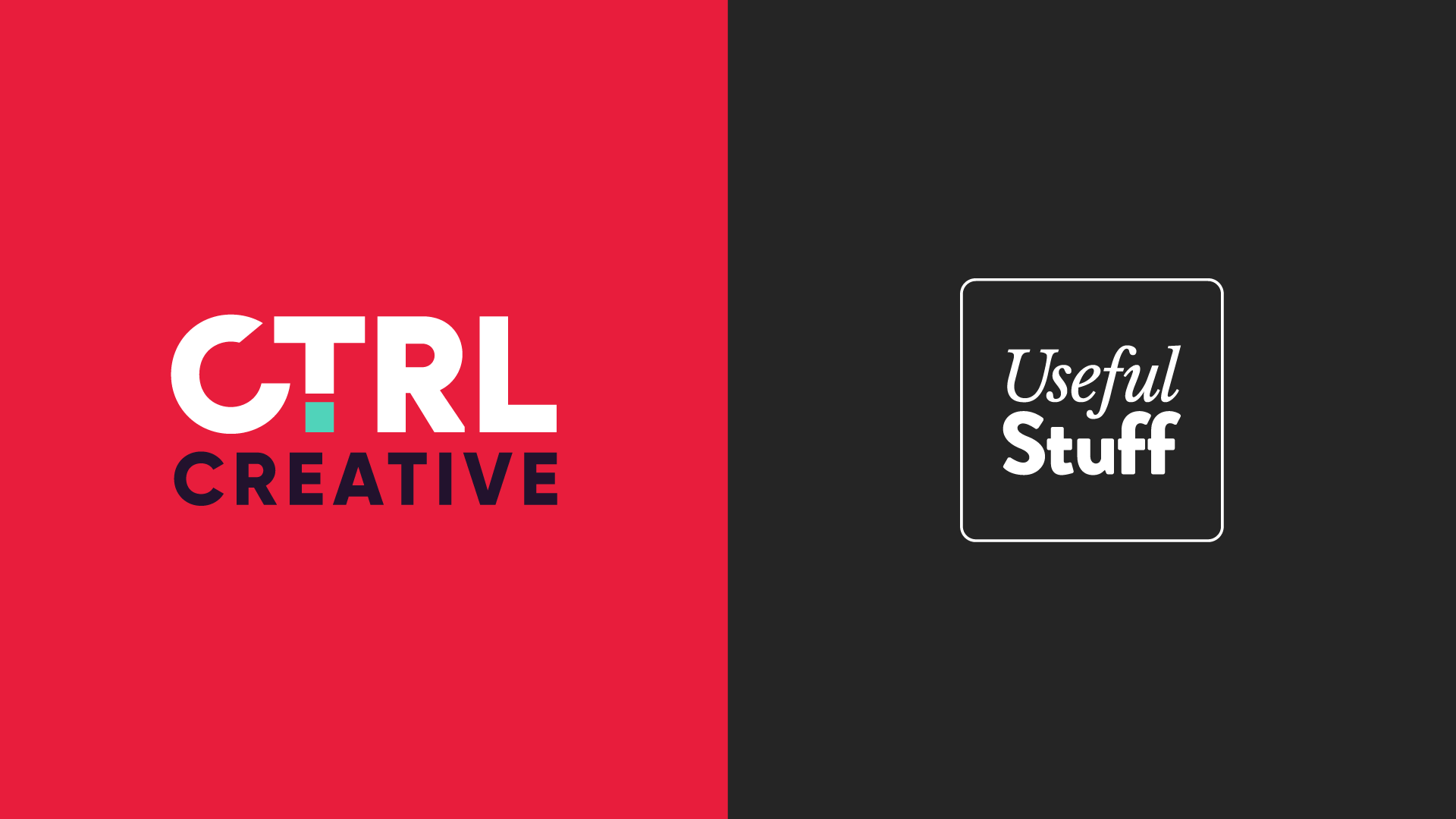
This is where CTRL came in.
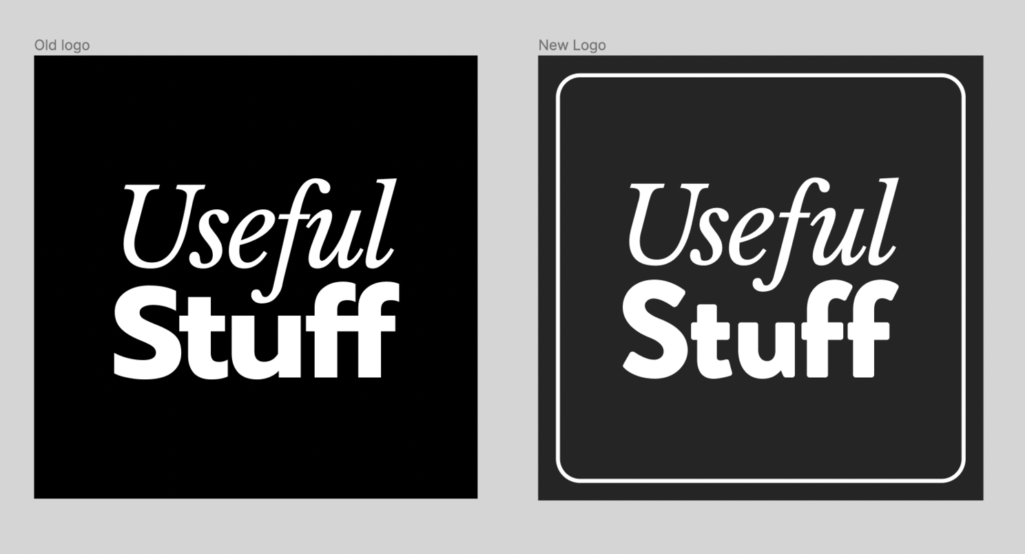
From a logo standpoint, there wasn't a lot to do but clean it up. To soften it a bit, we changed the font for 'Stuff' to a slightly more friendly rounded Sans Serif and contained the logo within a square with soft corners so that it felt more like a nice little tile or sticker you could put on everything.
But that only answers a small part of the challenge. How do you create a brand that almost anyone, designer or not, can maintain?
Matt and Heidi don't have the skills or the time to be creating imagery from scratch or doing complex editing work to stock imagery, but at the same time, it couldn't look generic. So this is what we ended up with.
It might all look complex to non-designers, but it's exceedingly simple. If you can click a mouse, you can make new elements for this brand. Let's show you how.
How can they make these designs?
It all starts with the imagery. Creating an image for the Useful Stuff brand takes just a few minutes and requires only a little bit of learning. The key is the polygonal lasso tool. Usually, you would cut objects out from their background using the pen tool in Photoshop. This is a bit of a task but an experienced designer can do this fairly quickly. The problem is the pen tool can be hard to master, and you can find yourself getting frustrated with complex shapes. The polygonal lasso tool doesn't have this problem, and with a few clicks you can make a pretty good selection around an object. It's not perfect, but it definitely doesn't have to be.
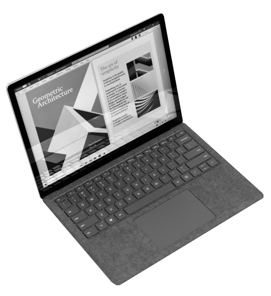
The image above took about 30 seconds to cut out and save. The one below took about 4 minutes.
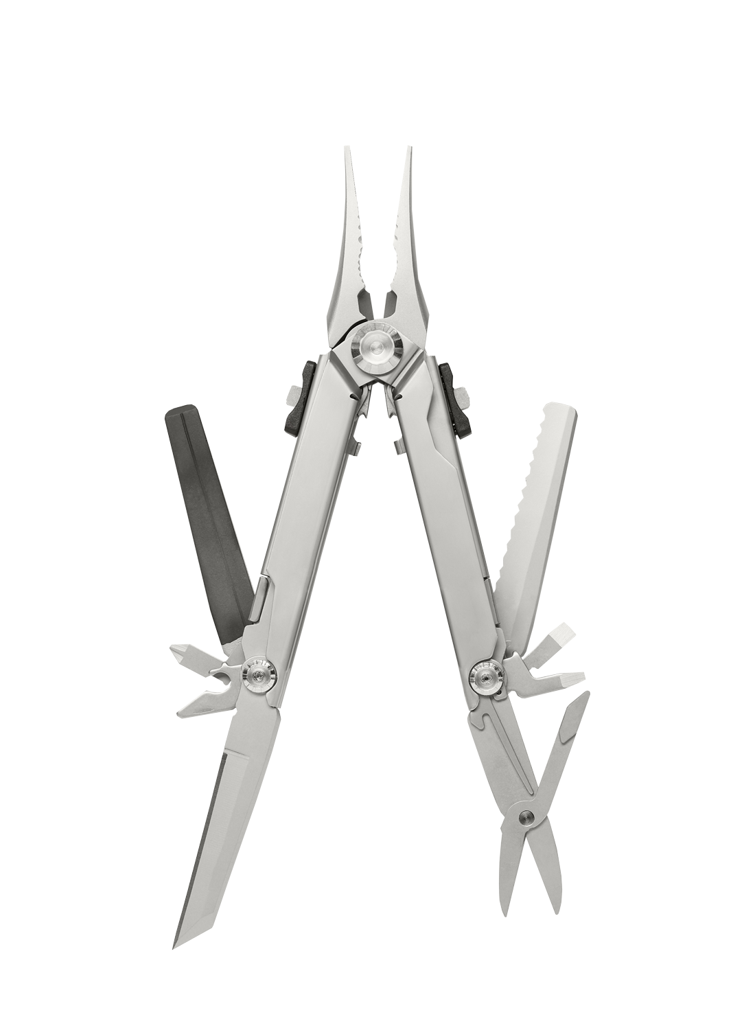
Sure, if you look closely you'll see harsh edges and imperfections, but the reality is you probably won't be looking closely. Additionally, these designs are always going to be displayed digitally, giving even more room for little things that probably won't be noticed by anyone.
The images are layer 1. Underneath that, we want to layer in some complexity. We created a small library of shapes to put underneath these cut out images.
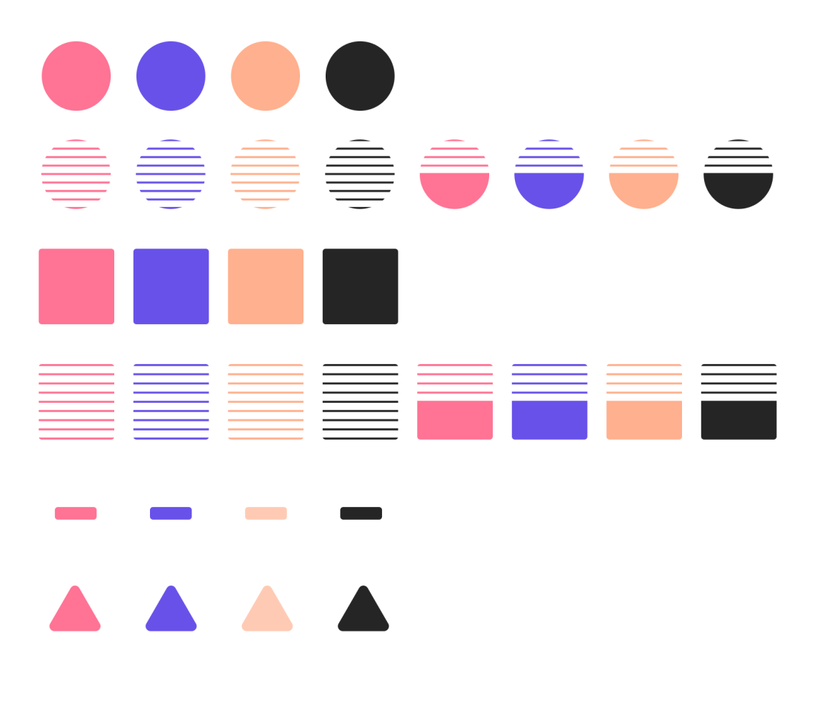
This is where Matt and Heidi can hopefully have a little bit of fun. I've included some examples for them of how they could combine colours, shapes and scale of objects to create different results.
These 2 simple layers create quite a lot of visual interest and a decent amount of complexity, so the rest of the designs are kept nice and simple.
Templates
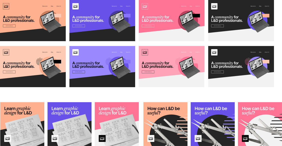
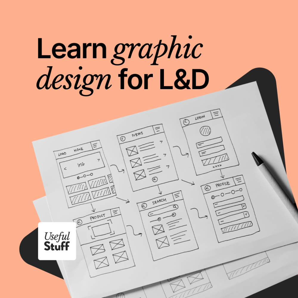
To keep things as easy as possible, we created templates for ads and blog images, as these are the most frequently needed images.

This blog template uses a great plugin for figma called Duotones. Just plug in two colour values and it will put a duotone filter over your image. This creates a little more visual interest than just using unedited stock photos and takes seconds to do.
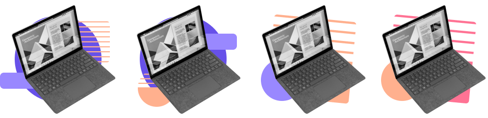
These ads only require a few clicks to create. There are a set of layers that can be turned on and off for logo variants and background shapes, then you can just change the text, swap out colours and replace the image. All up, it should only take a few minutes to create an ad from scratch, even for someone with no design experience.
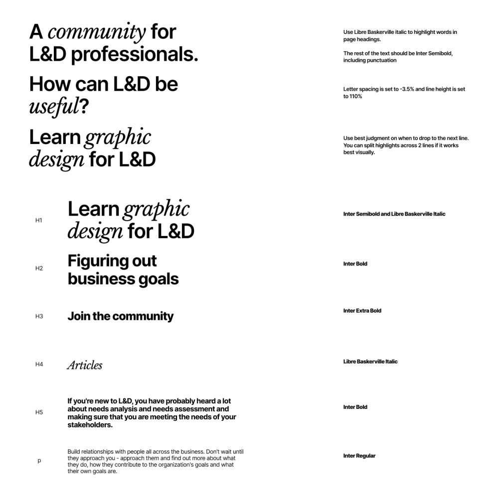
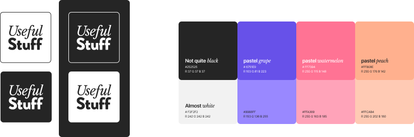
These simple guides for font usage are all that they need for all of their designs, including their website.
In addition, we've left instructions on templates that direct them on how to think about each design, how the hierarchy should work etc.
Wrapping up
So for now we're done, Matt and Heidi are off doing their own awesome work and using the base we created together to make all the imagery they need. If you are involved in L&D we highly recommend you check out their website and subscribe to their newsletter.
But what about you? Do you have a startup that needs branding you can maintain? If you like what you saw here, maybe get in touch and we can have a chat.
